Posted early while I'm at work, because my DSL is down at home...
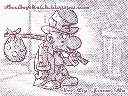
Character of the week, for Rick's character design blog--a hobo:
Character of the week, for Rick's character design blog--a hobo:
click above for larger view
I definitely took a different approach this time--this one was completely digital. I just started sketching in Photoshop, without knowing where I was going to end up. I refined the line art for the hobo in a separate layer and started shading the hobo and rendering the background in the original layer. For the final touches, I used a half-tone filter on the shading/background layer, adjusted the hue/saturation on the whole thing to get a sort-of sepia color, and then dropped in my signature and URL in an old-timey font.
There are some bad tangents and clutter where the hobo's upper lip eclipses part of his left hand... I need to be more aware of that kind of stuff in the early stages of sketching, because by the time I noticed it, I was too lazy to go back and re-do that whole section of the drawing.
Not a style that I'll be going with all the time, but this was quick and fun. It's good to mix it up so I don't feel like my stuff is getting stale.

4 comments:
I really like this little guy.. I think he could be helped if your friggin type wasnt all over his shite.... but.. its cool..and I think you coulda left more value in the BG pencils .. I get the effect but it might be too drastic.
The whole lip thingy could be dealt with just but thickening or darkening the line of the lip. i dont think i have to tell u more pronounced lines vs thinner lines pushes the thicker line forward.
when i saw this i thought "u did NOT draw this". it's so un-you. it's def cool, but to be completely honest there's a million crumb wannabes that draw this way. just be aware of ur style is all im saying. it's not a real criticism. no real weight to this. not even sure if it's a real suggestion. more of a half-thought.
as tha illmeister pointed out, ur name is WAY too pronounced. im sure no amount of talk will change this habit as u may not care about theory. but, in case u take interest: when u place ur name on a piece of work, u MAKE UR NAME A PART OF THE PIECE... in other words u make the piece a thing of glorified self-gratification all about u. the term 'masturbation' is oft used in such instances.
but that's fine arts theory. and in illustration and business it is not only ok to sign ur work, it's practically unholy not to. so here's my suggestion:
decrease size AND in cases like the text over the hat seen here, place the text BEHIND the hat. take some cues from magazine covers. a lot of magazines incorporate their name as part of the background because they know the suggestion of the name is all that's needed to tell u what mag u're looking at and the flashy cover art is what really needs to grab ur attention.
i certainly know when i come here to the J. HO SKETCHBLOG what i'm going to be looking at, so i dont need to be reminded thru the course of viewing ur work. if u MUST place such text into the pic, make it a part of the pic instead of slapping it on top as the last thing. give more thought to the actual design of the thing.
simple stuff. good drawing. suggestions. nothing really wrong with the work. keep at it or i will declare a vendetta.
peace, luv & chicken grease!
~ me
you are quick and fun. like a sweetbread. not stale, like a...muffin.
illgnosis: thanks man, you're definitely right about the value thing. as for the type, well, i'm going to keep marking my territory like a dog on the off chance that i someday create something worth stealing!
lordshen: as i mentioned to you over IM, crumb is definitely not an influence on me--more like akbar, jeff, and/or super mario. you're right about this drawing being uncharacteristic of me though... the type is there not for people who know that i drew this crap, but for people viewing my stuff out of context, so its here to stay. but thanks for the comments... VENDETTA!!!!!
annie: my biceps are like two pastries that would be sold for $15 a pice. TELL ALL YOUR FRIENDS.
Post a Comment