click above for larger view
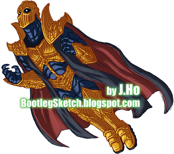
I have no idea why the good Doctor's character design so closely resembles that of Doctor Fate. You'll have to take that up with the creators of Champions. I also have no idea why my drawing turned out so meh and stiff. That is strictly my fault. I think the colors turned out decently though. Gold is shiny.
._.
OH HEY--don't forget to go to your local comic book store tomorrow and pick up the new JLA 80-page giant, which includes stories written by my pals Josh and Derek! Click on the pic below for details... DO EET!


1 comment:
--enlightened about "meh" :]
I dig the lighting and color lines on the gold for the character there, sweet
Post a Comment