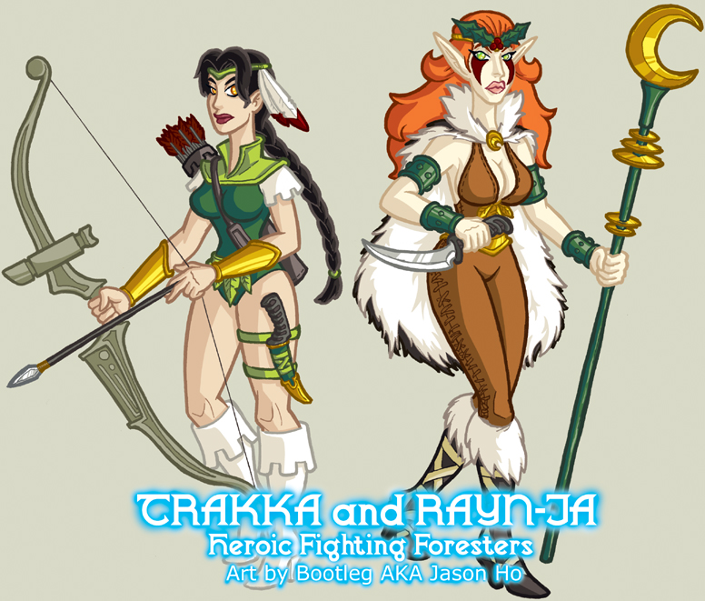
This illustration was for another re-design challenge at the He-Man.org fan-art forums. The parameters of this contest were a little different--instead of re-designing existing characters from the He-Man/She-Ra canon, the goal this time was to redesign an unused concept drawing from the He-Man toyline. The concept drawing in question depicted two different versions of an unnamed female ranger-type character. The two concepts looked distinct enough that I thought each one deserved a full-fledged character design. My post is here, the whole thread (including the original concept drawing) is here. Voting thread is here--I placed third.
click above for larger view
You may or may not notice, but the inks on this sketch are much cleaner than anything else I've posted so far. This is the result of a few factors:
- My natural tendency towards the anal-retentive style that I have referred to in the past (ironically, drawing loosely requires more conscious effort on my part).
- The relatively small size of the original pencil sketch, prohibiting a certain degree of looseness.
- Female subject matter--whom, if drawn with an excess of sketch lines, can begin to appear harsh even if that is not the intended result.
- More design work than usual--the more I have to design a character's costume elements, etcetera, the tighter I pencil. The tighter I pencil, the tighter I ink.
The coloring this time around was a bit difficult for me. Because I had no pre-existing colors to go off of, I went through several different color schemes before settling on what you see here. The trick was that the image needed to capture the bright, saturated, primary colors that I associate with the style of the He-Man universe. My first few attempts were done in subdued earth tones and olive-greens that were more befitting forest rangers in the "real" world. However, the result was that my redesigns simply looked like generic Dungeons and Dragons types rather than characters that looked like they specifically belonged in He-Man's world. With that in mind, I adjusted the colors to try and capture the cartoony feel of He-Man as best I could. I think Trakka's color scheme is more of a success than Rayn-Ja's.
Here's a brief profile that I whipped up for the two of them (oh, and the cheesy names were completely created by me):
* * *
TRAKKA (an Eternian "human") and RAYN-JA (of the Tree People) are expert foresters and sworn sisters. They patrol the wilderness ranging between the Eternian capital and the ancient home of the Tree People, guiding travellers and merchants, apprehending poachers, and negotiating disputes between various forest-dwelling tribes. TRAKKA's skills in archery are unparalleled by any villains that the Horde or the Snakemen have to offer--only Skeletor's henchman Ninjor has ever equalled TRAKKA's deadly aim. RAYN-JA uses her MOON STAFF to channel potent druidic powers that allow her to shape and communicate with the wilderness. They frequently ally with Moss Man, and the matching hunting knives that they carry were given to them by King Randor in honor of their heroic deeds.
* * *

4 comments:
first and foremost, i dunno which of us needs more of a life in the outside world. you for drawing these obscure non-identities or me for reading this blog LMAO
as for Rayn-Ja (that seriously can't be her real name) ur right about the colors. but i admit i enjoy seeing u draw women with hips, much like dames in the real woild.
remember, i went to an art school where women were either items to be drawn or were drawn like stick figures for fashion students, so ur hip-py girls here are refreshing.
the colors are bland, even for he-man imho. largely, tho, it's good work.
yeah, i haven't got much of a critique this time around. sorry. u already addressed everything else. DRAW ON, YOUNG DRAGON! DRAW ON!
thank you sir. yes, hips are good! i will keep drawing, as long as you keep on writing... e_e
I like the Trakka design though bolder colors would probably cement the He-Man look you are attempting.
Rayn-Ja's color scheme is too Christmas-y. It also doesn't help that she appears to have some mistletoe stapled to her forehead.
the incidental x-mas color scheme is okay with me, but actually the mistletoe was intentional--historically mistletoe was an important plant to druids. POINT FOR ME.
however, i also intentionally drew the mistletoe inaccurately--what we so often see in the media as mistletoe is actually holly. i chose holly because i figured most people would mistake it for mistletoe, and also the red berries of holly are more visually engaging than the white berries of real mistletoe. POINT FOR HOLLY.
either way, merry christmas suckers!
Post a Comment